
Showing posts with label basic. Show all posts
Showing posts with label basic. Show all posts
Wednesday, 1 May 2013


Wednesday, 27 February 2013
Update Post
Since recieving feedback from Mr Ford and Ms Sizer on my first draft I have progressed a lot, during this time I have
- Made a media playlist.
- Created an audience feedback questionnaire and got answers.
- Done peer audience feedback from comments on my blog including positives/negatives.
- Done 1st Draft teacher feedback and stated what i will be changing and what went well.
- Created updated drafts on the improvements i received from teachers and what i think.
- Created a second updated draft with further tweaks and improvements/changes.
From now i will be:
- Getting new and improved photos of my models in various amounts of different settings and different shots to find perfect photos for my magazine.
- Improve my drafts to create my final pieces, most tweaks will be making sure everything is in line perfectly.
- Look at more magazine inspirations for my final piece to find out an overall look i could use.
- Completely finishing my final piece.
Tuesday, 26 February 2013
2nd Updated Draft (Further Feedback)


These are further improvements for a second updated draft. I decided to do a second to use a range of different ideas and see how they work. For example on the contents page i have made it look more professional by ending the page level with a plain black line, i believe it also looks more simplstic and conventional. Along with this i have also took away the sub paragraph on my double page spread and included it at the beginning of my article, I'm unsure wether this looks better, however it does make my article look longer which is what was intended. Also i need to add paragraphs into my article.
Saturday, 23 February 2013
Updated Drafts
Updated Draft: Cover

In my front cover I have made a few tweaks and adjustments to make my page more professional and conventional. I have made the font for 'The Everything' bigger, this was a suggested improvement and I believe it looks more professional and eye catching. Along with this I have also adjusted positioning of my barcode and issue texts; I have put them all together which is commonly seen on most covers, this adds to the conventional look. For my text box on the left I have adjusted the cover lines, I have done this to give more of an inside to the magazine, this will attract more people into buying as there is more to tempt them.
Updated Draft: Contents

The updated contents page draft hasn't changed much, it was only really a case of correcting spelling errors and false information under the regulars heading. Along with this I have added web addresses at the top of the magazine, this is common on a lot of professional magazine contents pages so I thought it would be beneficial to use it and keep the magazine conventional. In addition I have also made the word 'contents' bigger, and tweaked the text box underneath, including the magazine name. I am happy with the overall look of my draft contents page and aim to keep this for my final version, with tweaks in the images used and texts.
Updated Draft: Double Page Spread

I feel i have made a lot of improvements in my double page spread, all from my feedback from peers and mainly my teacher's. I have made my article longer including more interesting information in their which still suits the language register. Along with this i have used a bigger drop letter, this gives more of a magazine feel. The overall look of the page is still conventional and simplistic which is my overall aim. I have adjusted columns so they are the same width and cut down to one pull quote which gains a lot of attention. In addition i have also added a different picture, i used a portrait photo that i had perviously taken of my models, this is because i feel it fits better with the page and the layout i want to portray compared to the landscape image. However i like the overall look of my previous image so i will aim to get that similar shot but in a portrait frame. I have also added other little elements to improve the overall look of the pages, for example a bold line under my article, this looks minimalistic and takes up space so it doesn't look too plain. Furthermore i have added a twitter and website address for the band; this is something which is common in real published magazines so i believed it would be a good idea to use.
Friday, 8 February 2013
Final Draft Double Page Spread

This is my final draft for my double page spread. I like the
colour scheme I have used because the black and white allow the blue to stand
out drastically which adds focus to pull quotes well. I have also underlined
the title of the pages in black, this makes the title seem more professional
which is what I intended. The overall lay out is quite conventional, it is
usual for a magazine to use an image with text by the side of it, however my
image hasn’t fitted how I intended which was a shame. I like the use of my
subheading because it introduces the article well which is what is often seen
in magazines.
I really like the image I have used the black and white is
affective because it keeps the overall look simplistic, for my main cover I might
think about having colour, but low contrast/brightness to keep it simplistic/neat.
I will try to get this kind of shot in a portrait view, this will allow me to
fill the whole half side of the page more accurately.
I like the use of pull quotes because they break the text up
and make the read of the article more interesting, for example a huge pile of
text can be quite hard and boring to read. Along with this the colour palette
has worked well for pull quotes, this is because it has allowed them to
significantly stand out in the article well.
I used Helvetica font, this font is sharp and easy to read,
however I will probably test different fonts for my final piece to find a
specific one that suits my magazine precisely. I made my title bold so people
can instantly see the name of the band clearly and have a better understanding
of what it is about, the sub heading adds to this as well.
For my final piece I will make a lot of improvements, for example
I will definitely put a lot more focus into the sizing of my image and the
amount of text I use, during this draft I didn’t put full effort into getting
the right sized image to fit the page perfect, therefore the page can be seen
to look pretty unprofessional, I would like my photo to cover half to page
fully, if not 2/3 but still leaving enough space for a decent amount of text
for my article. Furthermore I will make sure all of the article text boxes used
are level and the same width, this will allow for the professional look to be
enhanced.
Final Draft Contents

This is my final draft for my contents page. I am please
with the overall look because it is simplistic and conventional. It also uses a
neutral colour scheme consisting of black grey and white, which adds to the
minimal look. In addition the colour palette used allows the photos to stand
out more, which draws attention.
I like the overall layout of my draft contents, this is
because it looks smart and professional, and this is something I could take
into account when doing my final pages. I felt putting the information on the
left of the page was a good idea because in general people read from left to
right. I chose to put the most important features of the magazine at the top
because that’s what will most likely want to be seen first, and the regulars
will be something that appears in most issues.
For the title ‘contents’ I used courier in bold for the
font, I chose not to have ‘contents’ in very big writing because people will be
able to tell it is a contents page anyway, however it is still eye catching
because it is the biggest font on the page. The style of the font looks very
formal which is what I wanted. For the main texts I chose to use Helvetica
because it is a sharp easy to read font. Therefore it will be simple for the
audience to read comfortably.
I decided to use subheadings for each of the three photos I
used; this is so the audience can instantly interoperate the photo. I
underlined each sub title as well, I believe this drew more attention to them
and also made the overall look neater. Along with this for each photo I used a
circle and page number, it tit this so it is clear what page the audience will
be looking for, and it also fit in with the neutral colour scheme very well.
For my official piece I will spend more time on writing
articles to make it suit the genre of the text more, for example ‘the new ride’
text information is irrelevant to the magazine and what people will want to
read. Along with this I will put more focus into the lining of my photos, some
photos aren’t 100% in line, which can give it an unprofessional, and slightly
tacky look. In addition I will try to fill the whole page, for example I could
include twitter ads and email links etc. I think I will keep the overall layout
and scheme but just make vast improvements in making it look professional,
while still keeping the simplistic look.
Thursday, 7 February 2013
Cover Draft

This is my final draft cover of my magazine. I like the
overall look of my cover, the image is very eye catchy, I didn’t spend much
time taking my photos so the clothing and overall look doesn’t 100% fit the
genre, so in my actual cover I will have a lot more time to make it perfect. I
am planning on using a black and white image for my main cover; this is because
it adds to the simplistic look of the cover. It also allows for my fonts to
stand out well in contrast. I like the fonts I have used; the masthead is very
clear and the colour allows it to stand out and be easily noticed. My colour
scheme I have used is white black and blue, the two neutral colours allow the
blue to really stand out, especially with the black and white photo. For my final piece i will spend a lot more time on the actual photo and getting it perfect, this way the whole clothing will suit the genre as well as the surroundings.
For my final piece i am looking at keeping the same look with a black and white image because it looks simplistic and allows my text to stand out well, however i will try using colour because it will add more interest and enthusiasm to the cover. Furthermore i will spend time on my actual image making it sharper with a better overall fit to the cover. Along with this i will make sure the models expressions and body language matches the look i want.
For my final piece i am looking at keeping the same look with a black and white image because it looks simplistic and allows my text to stand out well, however i will try using colour because it will add more interest and enthusiasm to the cover. Furthermore i will spend time on my actual image making it sharper with a better overall fit to the cover. Along with this i will make sure the models expressions and body language matches the look i want.
Monday, 4 February 2013
Magazine Drafts
DRAFT COVER


DRAFT CONTENTS

DRAFT DOUBLE PAGE SPREAD

These are a few mock drafts for each of my pages. I haven't used my own photos for these drafts because i want to get an idea of the style of the image i use and how it contrasts/compliments my overall layout. I am not completely happy with any of these because they are drafts and ideas. For my final pieces i would want to change these a lot and put more effort in to give a sharp and professional look.
Draft Article
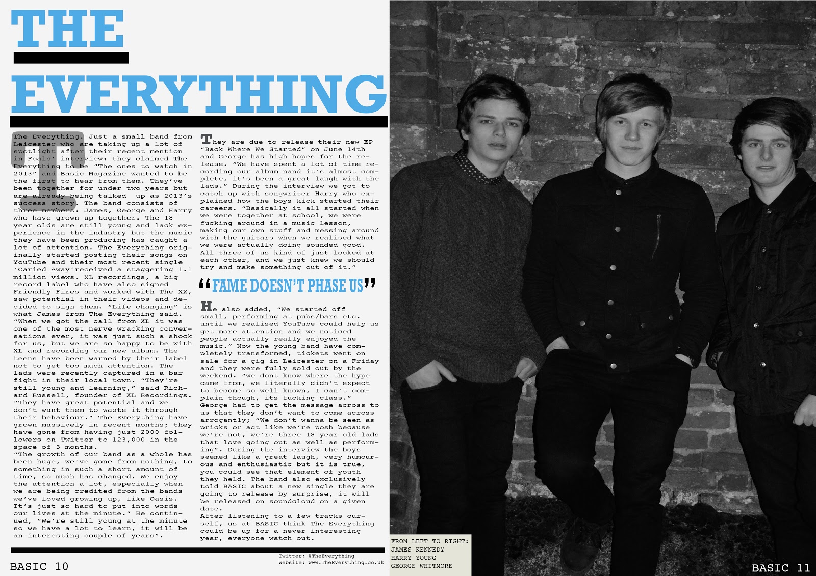
The Everything. Just small band from Leicester who are
taking up a lot of stoplight after their recent mention in Foals’ interview,
they claimed The Everything to be “the ones to watch in 2013” and Basic
Magazine wanted to be the first to hear from them.
The new band consists of three
members James, Hadley and Reece who have grown up together. The 18 year olds
are still young and lack experience in the industry but the music they have
been producing has caught a lot of attention. The Everything originally started
posting their songs on YouTube and received a staggering 1.1 million views on
their most recent single “Carried Away”. XL recordings, a big record label who
have also signed Friendly Fires to their label and worked with The XX saw
potential in there videos and decided to sign them on. “Life changing.” Is what
James from The Everything said, “when we got the call from XL it was one of the
most nerve racking conversations, it was just such a shock for us, but we are
so happy to be with XL and recording our new album” The teens have been warned
by there label not to get much spotlight, the lads were recently captured in a
bar fight in their local town. “There still young and learning,” spoke Richard
Russell, founder of XL Recordings, “they have great potential and we don’t want
them to waste it away through their behaviour”.
They are
due to release their new EP “Back Where We Started” on June 14th and
Hadley has high hopes for the release. “We have spent a lot of time recording
our album now and its almost complete, it’s been a great laugh with the lads”
During the interview we got to catch up with songwriter Reece who explained how
the boys kick started their careers. “We’ve always been mates during school,
music has also been our interest so we just thought, fuck it lets make a band…
and it worked!” he also added “We started off small performing at pubs/bars
etc. until we realised YouTube could help us get more attention, and we noticed
people actually really enjoyed the music”
Band Profile
Band Name: The Everything
Music Style: Guitar, Bass Guitar, Drums, Synths
Influences: Foals, Two Door Cinema Club, The Vaccines, Everything Everything, Friendly Fires, The Maccabees
Members: 3 members, bass guitar, drums and vocals. 3 males, 1 guitar and vocal, 1 bass guitar, 1 drums.
Cover: 3 members, possibly two so i can avoid overcrowding and cramming on the cover which could potentially give off an unprofessional look.
Style: stand next to each other to add to the simplistic look, or in a triangle e.g 1 in front, two behind, to add a feeling of importance to the lead singer of the band. Clothing will be skinny jeans, plain simple t shirt or shirt branded, e.g fred perry. Mid shot, no shoes or full jeans revealed. Hair style is neat, add to simplistic look, also short back and side haircut. Or messy hair, contrasts to simplistic look and fits the genre better, conventional look of a typical indie/alternative band e.g foals. Or more vintage, old fashioned shoot, adds effect well because it looks minimalistic.
Examples


Subscribe to:
Posts (Atom)