
Showing posts with label coursework. Show all posts
Showing posts with label coursework. Show all posts
Tuesday, 30 April 2013


Tuesday, 26 February 2013
2nd Updated Draft (Further Feedback)


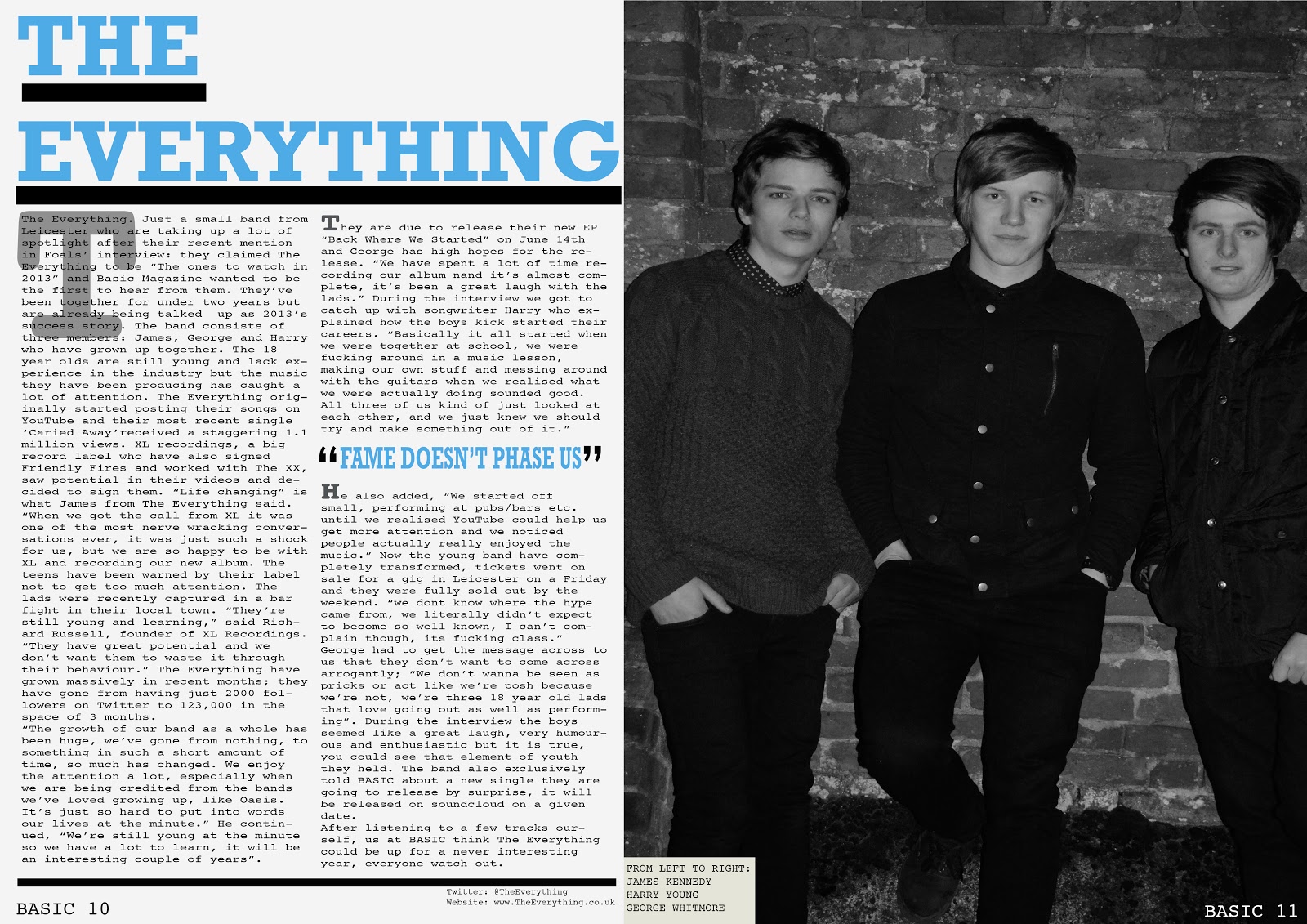
These are further improvements for a second updated draft. I decided to do a second to use a range of different ideas and see how they work. For example on the contents page i have made it look more professional by ending the page level with a plain black line, i believe it also looks more simplstic and conventional. Along with this i have also took away the sub paragraph on my double page spread and included it at the beginning of my article, I'm unsure wether this looks better, however it does make my article look longer which is what was intended. Also i need to add paragraphs into my article.
Wednesday, 30 January 2013
Media Pitch
Make a video of your own at Animoto.
Final pitch for my media magazine. I believe it includes all the key concepts needed.Monday, 28 January 2013
FONTS


In the magazine it is important for the font to not only fit
the genre of the magazine but also to look professional and make a good first
impression to the reader, for example, hard to read informal font would not
suit a magazine because it would be uncomfortable for the audience to read and interoperate.
I have come up with a selection of fonts, which I believe
could be ideal for my magazine. The fonts for both mastheads and cover lines +
straplines are clear easy to read fonts. I want the font to be simplistic and
conventional. For my masthead I want the font to be clear, bold and eye catchy.
This is because the font is the first thing the reader looks at, along with the
image on the cover, when considering buying, therefore because of this the font
needs to be good enough to lure the customer in.
For straplines, cover lines and basic text I want the photo
to have a formal feel towards it which will create atmosphere for the magazine
and make it a more enjoyable read, a font I do like is Tahoma, this is because
it is simplistic and easy to read, along with this it also looks professional.
The contents page should include conventional simplistic
font, this is because it is the main page readers will continuously flick back
to in order to find a different article to read. If the font is difficult to
read it will be a massive off put for the reader. In addition the double page
spread should have an easy read font. A typewriter font would be a suitable
choice because it is commonly seen in newspapers and magazines, therefore it
would appear conventional plus comfortable.
Friday, 25 January 2013
Contents Analysis - Kerrang
The kerrang contents
page consists of their conventional colour scheme black yellow and white. Readers
of the magazine will be used to this colour scheme therefore information that
they want to stand out more significantly can be used in a different colour,
for example the subscription of the magazine is advertised behind a red box in
the corner to grab attention.
I like the use of the image which takes up roughly half of
the page, this adds more interest to the page, rather than it just simply
stating what will be inside. The iconic kerrang logo is used on the page a
couple of times, this is just a use of repeating the name so it gets into
peoples heads more, and they are consistently being reminded of the name.
Contents is written in the top left corner of the page in
yellow behind a black fill. This allows the title to stand out clearly so the
reader knows what page they are on. A unique
feature of the page is this how the contents page shows a small image of a
double page spread and indicates what page it is on. This makes the contents
page more filling and adds more interest yet again. Kerrang don’t go for a
conventional simplistic look, they have more of a messy look that compliments
the type of music the magazine is based on. Sub headings for each section are
written in yellow block font clearly behind a black fill, this looks professional
because it is easy to see what will be involved under each heading.
Kerrang use a lot of images on their contents page, this is
to give a more sophisticated look. The main image is a man crowd surfing; this
interesting image can show passion for the music which is what the readers will
enjoy seeing. The overall use of fonts is good because they are all clear to
read, there isn’t any writing which you struggle to read which makes it more
comfortable for the reader, this is something I can think about when designing
my magazine.
Contents Analysis - NME
This contents page is a lot more
filling compared to the Vibe contents page. There is information about all of
the pages inside the magazine everywhere; this allows the audience to find and
look at everything specifically, which is better than having to go through
every page. A main contents headline is positioned under the main image which
clear bold black font saying ‘artic monkeys’ this instantly allows the reader
to see the band, which compliments the photo.
The page is titled NME contents,
this consists of the conventional NME logo and contents written in clear block
font, it is very easy to read which is affective. All of the feature titles on the page are in
white block capitals behind a black fill, this makes the font stand out a lot
more which allows the audience to notice each section more comfortably.
NME use the same black red and
white colour scheme. This scheme matches the logo, which allows the magazine to
bring across a more professional look. However they break their colour code
with the use of a box at the bottom of the page. The colour scheme for this box
includes yellow font on a black fill, the yellow will instantly catch the
audience’s eye because it’s the only colour difference. They are advertising a
subscription for the magazine; this is affective because it is eye catching.
The image the contents page uses is
quite conventional for NME because the majority of their contents pages use a
medium sized image in the centre of the page. Writing is positioned around the photo,
which allows more focus on the image itself. All of the page numbers are
printed in red font, this sticks with the colour scheme and allows it to stand
out next to the titles; this is so the reader instantly knows where to look for
their page. The date is positioned under contents, which stands out clear on
the black fill behind it.
Wednesday, 23 January 2013
Mood Board 2 - Urban

Mood Board 1

Subscribe to:
Posts (Atom)